Role: Design, Animation, & Sound Design
Research
The problem: How can we create a 30-sec spot that captivates and excites an audience?
This project had a brief with fairly open requirements in terms of the visual identity. It asked for simple imagery and some visual metaphors instead of literal messaging.
I needed to brainstorm with a pencil to paper to come up with ideas of how the script can look visually, a good old-fashioned brain dump. Next, I took to Pinterest to start gathering inspiration from all corners of the internet. After hours of research I felt confident to put together a moodboard that could help steer the direction of the explainer video:
Moodboard
Design
The next step after creating a moodboard was to sketch up some storyboards. Doing it with pencil and paper allowed for fast sketching and ideation. Rather than doing it on a computer where I might be a bit too fixated on how everything looks design-wise.
Storyboard
Styleframes
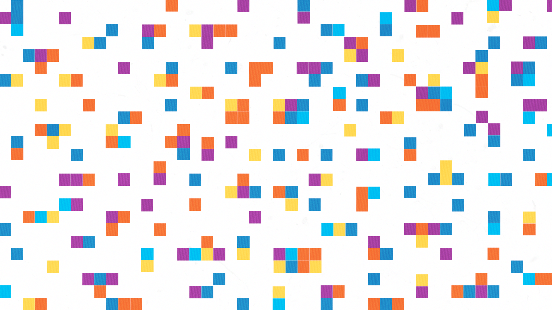
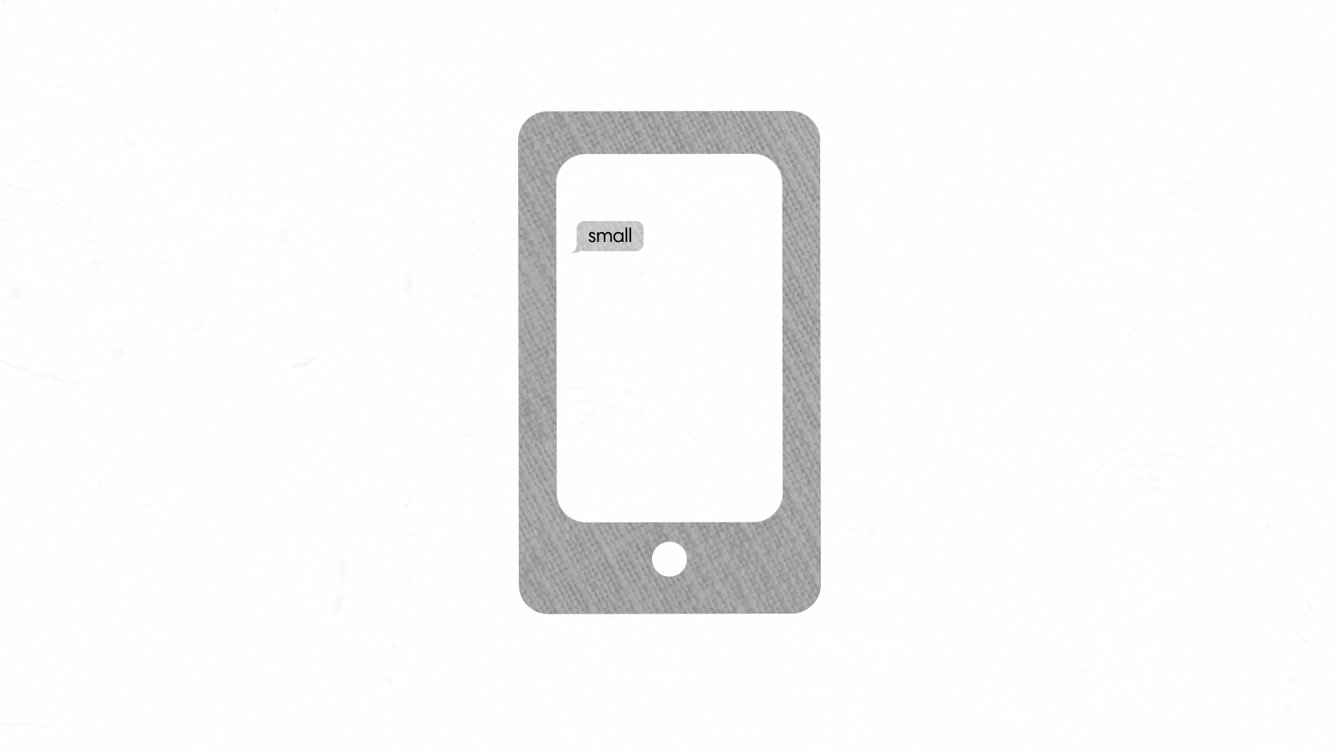
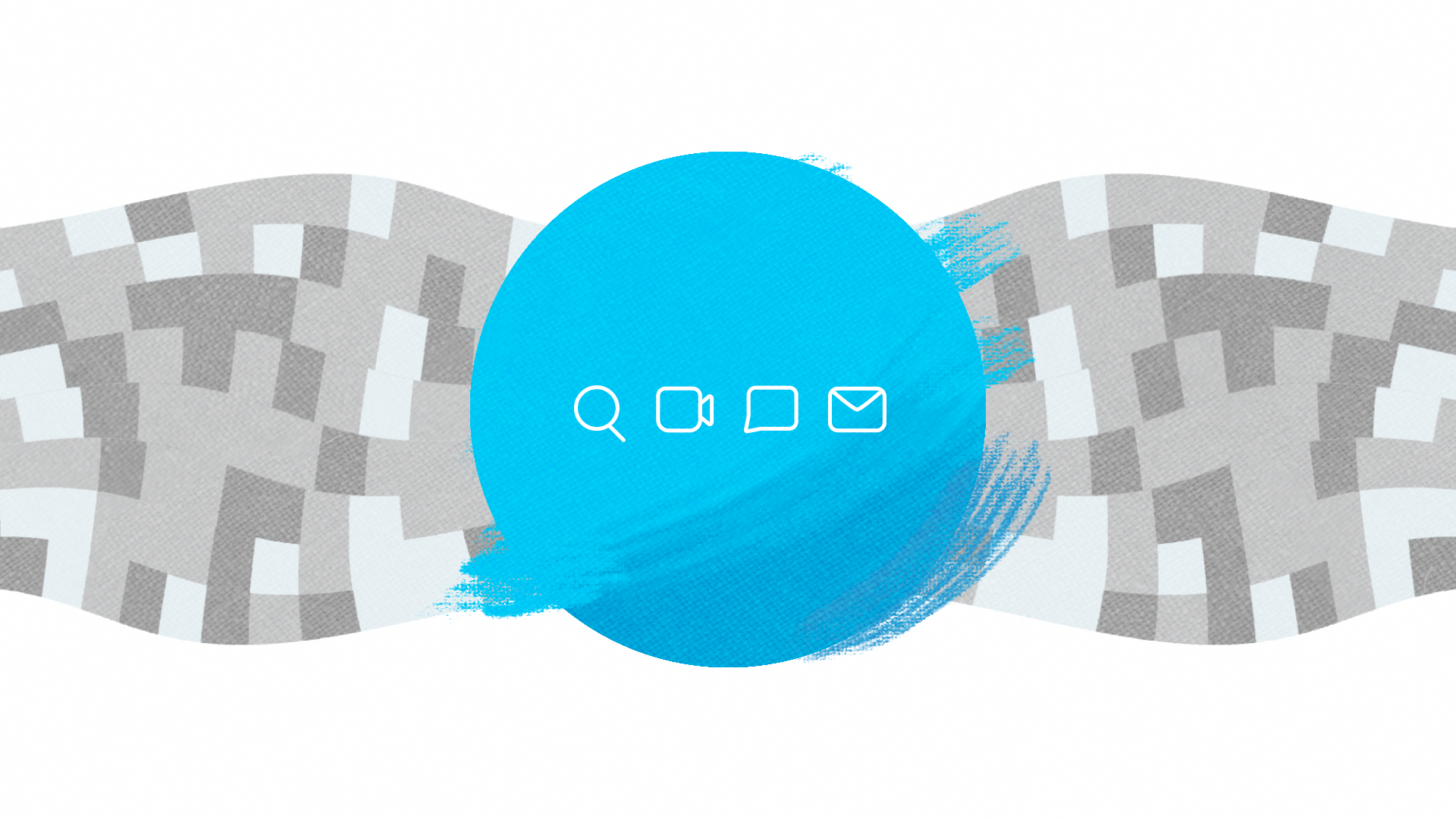
Next up was to create the final styleframe designs based on the storyboard sketches. Here are some of my favorites:


Animation
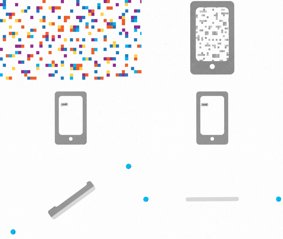
Finally, I got to dive into the wonderful world of animation. I wanted the animation to flow from scene to scene using smooth transitions usually in the form of match cuts. The designs also opened the door for some exploration of looping textures and frame-by-frame texturing in photoshop. This was my first attempt at frame-by-frame ever, and it was done by adding "slop" to the hero element with paint strokes outside of the circle. This allowed for an organic & approachable message that could be sent to the viewer without having to say anything at all. Here are some of my favorite moments:


This brief and project were completed as part of School of Motion's course Explainer Camp (which I highly recommend). I learned a ton of valuable nuggets from Jake Bartlett throughout the course!


